Usdaw
Relaunching the digital platform for one of the UKs largest trade unions, supporting over 360,000 members
Protecting worker's rights across retail, distribution and warehousing sectors

Background
Usdaw (Union of Shop, Distributive and Allied Workers) is the UK's fifth-largest Trade Union representing over 360,000 members in retail, distribution and warehousing.
Usdaw engage in consultation with some of the leading supermarkets and distribution companies nationwide and organise their network of reps to provide support and advice to colleagues.
Due to a fall in membership rates and changes in working practices – such as zero-hours contracts and high seasonal staff – Usdaw’s focus is to protect workers’ rights and working environments.
Business challenge
Usdaw needed to shift perception as a trade union and focus on their impact and the positive changes they have enabled.
Alongside their recent rebrand, this website project was part of a bigger programme of work moving towards greater awareness of Usdaw as a trade union in the retail sector and improving their reputation amongst those who know them.
A key challenge was a rethink of how the website could better support the network of reps who are vital to growing the membership and delivering the Usdaw services at grassroots.
Their website technology was out of date and frustrating to use. With nearly 4,000 pages of content dating from 2015, a content migration strategy was a critical part of the project.
Getting the foundations right
The team at Usdaw wanted to get back to basics with this project so we initiated an in-depth Discovery phase, starting with a customer survey followed by an exploration of their needs, in a sector that is constantly changing around them.
We developed a set of profiles reflecting the spectrum of engagement amongst non-members, members and union reps. Mapping out their experiences and touchpoints along the way; When do non-members get in touch? What are they coming to the site for? Where are the trigger points?
We interviewed Subject Matter Experts within the organisation and end users. We explored the idea that members wanted content exclusive to them via personalised ‘gated’ areas; the use of a digital membership card and how Reps could get better support for member recruitment and ‘issue resolution’.
With 75% of users accessing the site on mobile devices, we needed to ensure a mobile-first design was a key consideration in delivering a relevant experience.
Early-stage testing
With the Discovery work completed, we took the opportunity to test our findings at the Usdaw annual reps conference in Blackpool. We wanted to test our proposed user journeys with this key user group before moving into design and production.
Reps form the backbone of the organisation and the new website had to provide them with a vastly improved support service. A full day observing reps walking through the key stages planned gave us valuable insights into the actual performance of our proposed approach.
Our approach
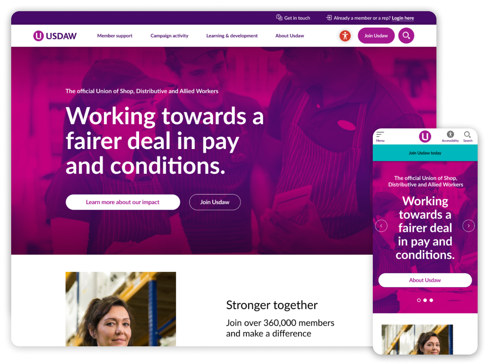
A big focus was on ‘decluttering’ the content and bringing clarity to the design to create emphasis on the key campaigns and initiatives that Usdaw support and the benefits of becoming a member.
We created more effective signposting, providing clearer links for sign in and joining, providing room for content to breath and breaking down long form content so that its digestible for the user.
We created an updated, fresh digital brand with a vibrant pallet that helped to reposition the union as a modern, forward-thinking organisation.
We recommended a switch to the Umbraco CMS, which required a thorough migration plan to move 4,000 items of content across with minimum manual effort, while maintaining existing search rankings.
The existing reps hub section sat alongside member content, some of which had become intertwined with Usdaw marketing and member materials. We wanted to ensure that Reps had a hub of resources, which were easy to access and utilise some of the rich information previously hidden.
Outcome
We relaunched the Usdaw site to deliver a wealth of information to end users easily and clearly communicate the proposition of the Union and its value to members.
Providing valuable resources for members and non-members alike, tailoring the experience for these users and streamlining the Reps hub design for better mobile experience, this gave their web teams a design system that provided some flexibility but enough structure to ensure a consistent experience and look and feel.
Let’s move you forward
Are your digital experiences holding you back in some way, or do you need to propel the business forward, quickly?
Get in touchUniversity of London


