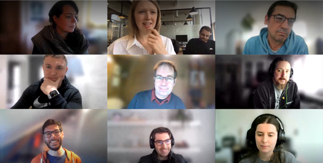
The fact that the roundtable was entitled “Accessibility - Building inclusive digital products” was intriguing and challenging in equal parts, especially for someone who has not – so far – endeavoured to create a digital product themselves.
I was no stranger to the concept of accessibility and several of its requirements and applications. However, the team’s approach to the discussion and the ways in which it would push us to reflect on our work offered some great food for thought.
The conversation kicked off with a couple of exercises that seemed simple enough; they involved dropping the mouse from the equation. Navigating a website via tab in under 90 seconds for example, wasn’t too arduous a task. However, imagine needing to access a certain link that you had to tab over 50 seconds to reach at the bottom of the page? What kind of user experience does that contribute to? A few minutes into these navigational exercises, and our interest was peaked.
After the team had gone through the presentation, a brainstorming session kicked off. There was no shortage of questions on the subject. What kind of perspective should you adopt when building a digital product? How many routes to accessibility are there? How can we rethink the construction process in the service of inclusivity? How can we challenge ourselves to adopt different perspectives throughout the build process?
We wouldn’t venture to address every single question that popped to mind throughout the roundtable – that would most likely be a herculean undertaking. What we did, however, is discuss the various elements that factor into this conversation. Not taking into consideration the legalities and frameworks of the subject for the purpose of this particular blog, the focus was centred on sparking the discussion, understanding the questions we need to be asking and how we can begin to answer them little by little.
An example of the simple steps we could be taking is creating a space where our team members would feel encouraged to add resources, thoughts and ideas on accessibility. Which we promptly did. As one of the arguments tossed around brilliantly underlined: for the majority of digital products out there, there isn’t a space dedicated to this discussion. There isn’t a complaint form or a feedback channel that users could leverage to bring this theme up on a recurring basis. Perhaps it’s the simplest of things: including more people in the discourse could ultimately make the difference for accessibility and the way it is approached in building digital products.
On my end, I felt quite proud of a team that was keen to jump start discussions for absolutely no other reason, than to contribute even more to their work. Especially given that time, within an agency’s day to day, is quite a rare commodity!

A big thanks is in order to Amy, Quba’s Head of UX and Design, and Ji, Quba’s Head of CMS Development, for taking time out of their busy schedules to bring this important subject to the forefront.
If you would be keen to keep reading on accessibility, then you might find Gov.uk’s Understanding accessibility requirements for public sector bodies and Accessible communication formats interesting.
Get more of this by subscribing to our regular newsletter
 Nina Christopoulou


